
Measuring SEO: the Search for Meaning
To be or not to be :)

Hello Riddlers!
📌 Your support keeps this newsletter FREE —> [☕Buy Me a Coffee☕]💡 Want more from me? [SEO Strategy Course] | [Build Your Own SEO Tools (with Python & Agentic AI)] | [Premium SEO Mastermind]
The search for meaning
Measuring performance is what gives our work meaning.
And in SEO, meaning has always been… complicated.
Showing ROI has never been easy—but in the past few years, it’s become even harder.
Not because SEO isn’t driving value.
But because of the ambiguity baked into the data we rely on.
You know the drill.
Google Search Console doesn’t give you the full picture.
Third-party tools estimate search volume—sometimes over, sometimes under.
There’s a massive gap in the funnel, where keyword-level attribution breaks down.
You’re left asking:
Was this conversion driven by branded search?
Or non-branded discovery—the thing we actually want to prove?
And just when you think you’ve made peace with the chaos…
We find out that impressions in Google Search Console have been inflated for over a year.
Impressions—arguably one of the few metrics that could hint at visibility, demand, even brand growth—turn out to be unreliable.
So you start wondering:
What exactly are we measuring?
And why?
The SEO is dead narrative
I’m tired of hearing it. You probably are too.
SEO is not dead.
But repetition is powerful.
The more something is said, the more people believe it—regardless of whether it’s true.
And here’s the real issue:
It’s not SEOs who believe this narrative.
It’s the people further from the work—executives, business owners, CMOs.
The moment SEO becomes hard to measure, it becomes easy to dismiss.
“If we can’t measure it, we cannot see it, and if we cannot see it, it must not be working.”
And honestly?
The ambiguity doesn’t make it easy to push back.
Time series
So… bring it on.
What do you have up your sleeves, Sara… right? 😄
Fair question.
The answer I have for you today is Time series. You know the performance graphs we use all the time, x-axis is date, and y-axis is whatever metric?
Exactly that, but now we are going to use that in a smarter way. Here’s how:
Get your graph ready… just stay away from impressions for the time being.
Then,
For the same period, plot 2 different metrics, clicks and sessions for the same time period for example or clicks and trends from Google trends. I have this graph from my Build Your Own SEO Tools (with Python & Agentic AI) course, where I compare impressions of my website (make that clicks starting today) with the search interest from Google trends for the keyword “Python”.
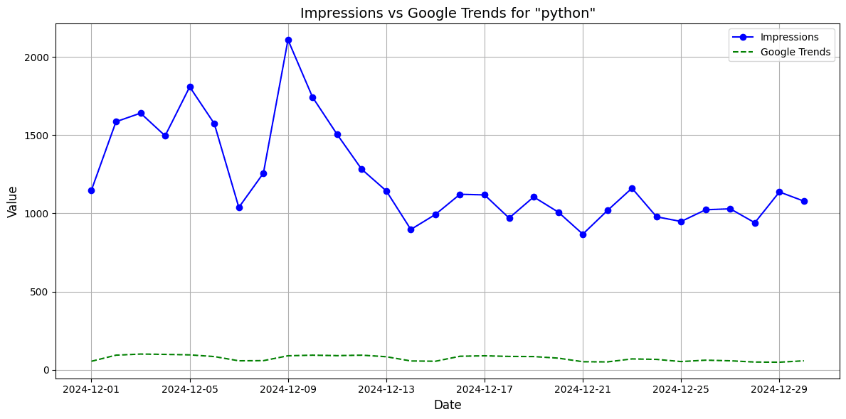
From the graph you can see that while the interest remained steady, I had a surge in performance at some point. That gap tells a story. Demand didn’t change.
My performance did. We are not looking for exact numbers, we are looking for patterns. Whatever I was doing in December 2024, it was working and I should probably do that again!
Here’s another example of how insights can be pulled by comparison:
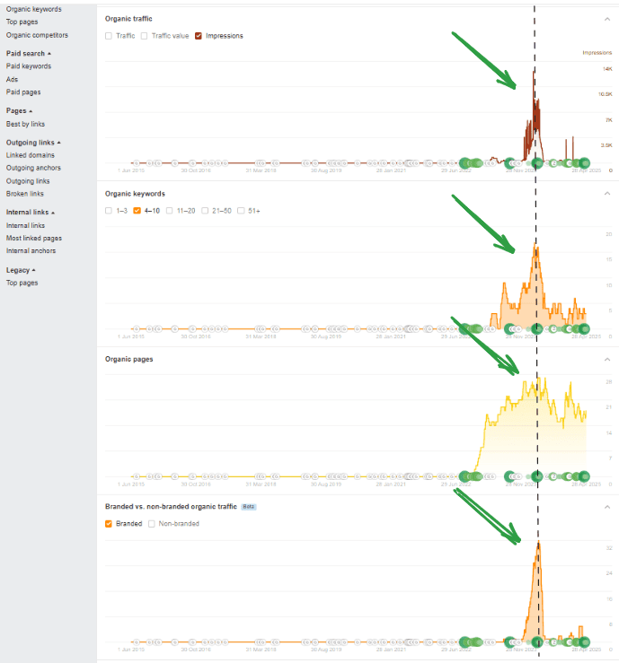
In the screenshot, you can see that there's an increase in organic traffic, that's aligned with an increase in the number of organic keywords, which is NOT due to an increase in the number of pages, but rather due to an increase in branded searches!!!! [I wrote about this here]
Last but not least my favorite example, direct traffic vs organic clicks. You can show the direct impact and relationship between your direct traffic which often goes unattributed to specific marketing efforts, to your SEO work, if your graph looks like this (do you see how they go hand in hand with absolute harmony?)
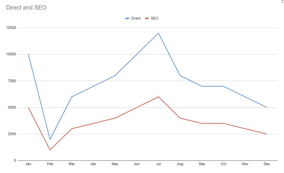
That was actually a real-life case I experienced in the past for one of the websites I worked on. Putting different metrics side-by-side does magic.
Before and after
If you’re not using GSC Guardian or Advanced GSC Analyzer chrome exteions you should change that right now imo!
Both allows you to plot a vertical line that can be used to correlate traffic changes with Google updates or better development releases and SEO implementations!
Here’s an example of how they can highlight on a graph the duration of a Google update for you so you can see your traffic pattern during the update, and also visually compare before and after!
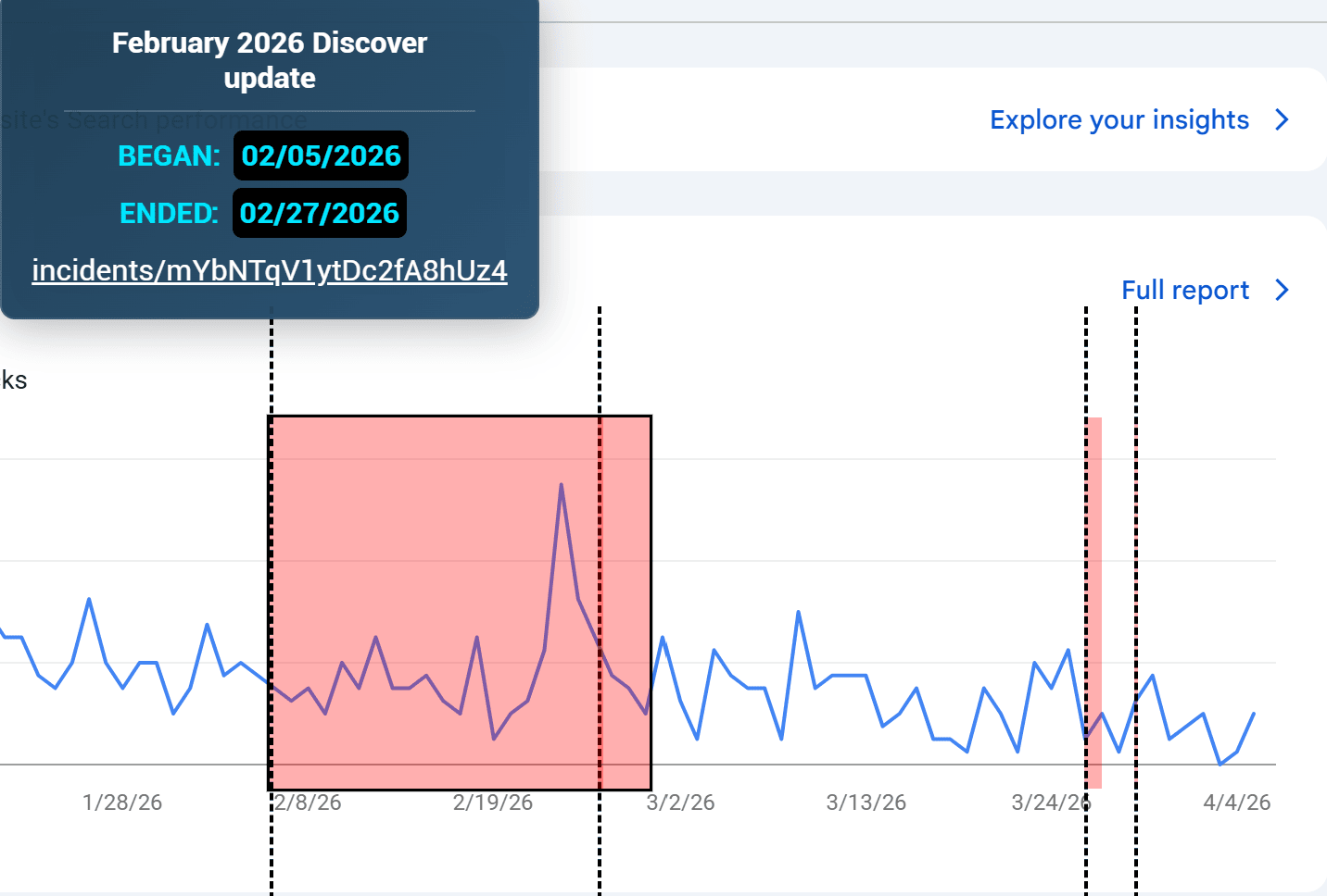
I had this discussion recently with the rollout of a new SEO feature, and having a vertical line on the clicks graph, maybe one of the easiest remedies to show performance changes.
Seasonality
Don’t forget about seasonality.
Compare your performance to the same time last year, and look at it both numerically and visually. This makes it easier to tell whether growth is coming from your SEO efforts—or just seasonal demand.
Look for patterns, 2 lines in the same graph…
And That’s a Wrap (Almost 😄)
Ya time series are your new best friend in attempting to make sense of all the chaos, I’m not saying they solve everything, but definitely having those tips in the back of your pocket will help!
Thanks for reading this far and see you next newsletter!
Support the Riddler!
Sign up for my newsletter if you’re not already.
Share the newsletter and invite your friends to signup. Help me reach 2k signups by end of 2025 please 🙂
Provide feedback on how I can make this newsletter better!!!
If you’re an SEO tool or an SEO service provider, consider sponsoring my newsletter. I’m also open to other partnership ideas as well.
Disclaimer: LLMs were used to assist in wording and phrasing this blog.